Visualizing raster layers
Of course, it is always highly useful to take a look how the data looks like. This is easy with the rasterio.plot.show() function of rasterio.
Basic plotting
In [1]: import rasterio
In [2]: from rasterio.plot import show
In [3]: fp = r"C:\HY-DATA\HENTENKA\KOODIT\Opetus\Automating-GIS-processes\Data\Landsat\Helsinki_masked_p188r018_7t20020529_z34__LV-FIN.tif"
# Open the file:
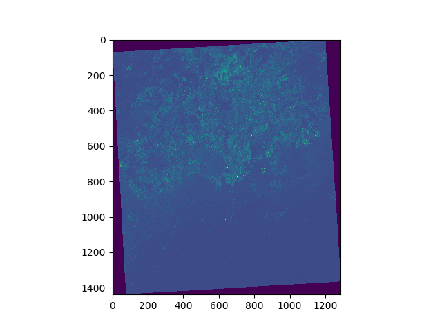
In [4]: raster = rasterio.open(fp)
In [5]: show(raster)
Out[5]: <matplotlib.axes._subplots.AxesSubplot at 0x20c9941ef60>
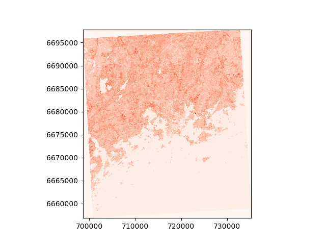
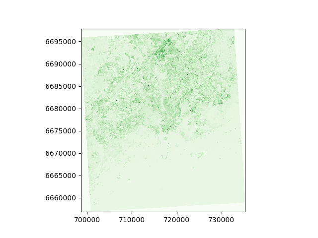
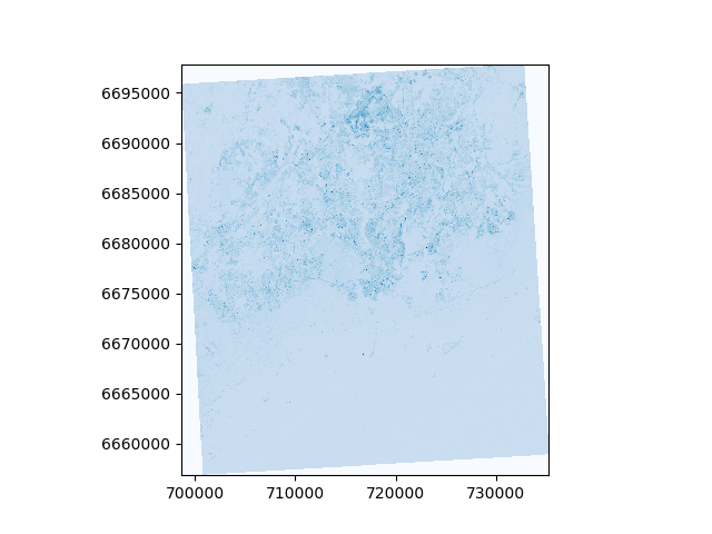
You can also plot different individual channels.
In [6]: show((raster, 4), cmap='Reds')
Out[6]: <matplotlib.axes._subplots.AxesSubplot at 0x20c9953e438>

In [7]: show((raster, 3), cmap='Greens')
Out[7]: <matplotlib.axes._subplots.AxesSubplot at 0x20c9953e438>

In [8]: show((raster, 1), cmap='Blues')
Out[8]: <matplotlib.axes._subplots.AxesSubplot at 0x20c9953e438>
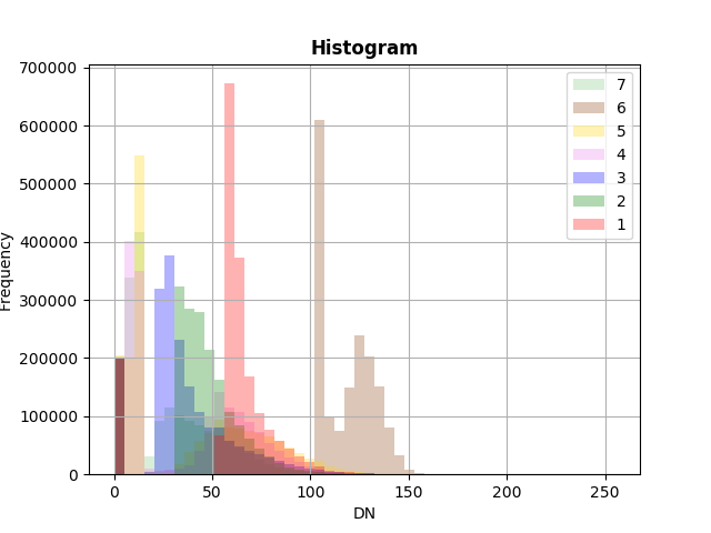
Histogram of the raster data
It is fairly common that you want to look at the histogram of your data.
Luckily that is really easy to do with rasterio by using the rasterio.plot.show_hist() function.
- Let’s draw the histogram of our raster dataset
In [9]: from rasterio.plot import show_hist

In [10]: show_hist(raster, bins=50, lw=0.0, stacked=False, alpha=0.3,
   ....:       histtype='stepfilled', title="Histogram")
   ....:
False color composite
Todo
Add materials about how to stack bands and create a false color composite.