Static maps
Download datasets
Before we start you need to download (and then extract) the dataset zip-package used during this lesson from this link.
You should have following Shapefiles in the dataE5 folder:
- addresses.shp
- metro.shp
- roads.shp
- some.geojson
- TravelTimes_to_5975375_RailwayStation.shp
- Vaestotietoruudukko_2015.shp
Extract the files into a folder called data:
$ cd
$ unzip dataE5.zip -d data
Static maps in Geopandas
We have already seen during the previous lessons quite many examples how to create static maps using Geopandas.
Thus, we won’t spend too much time repeating making such maps but let’s create a one with more layers on it than just one which kind we have mostly done this far.
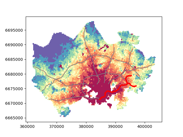
Let’s create a static accessibility map with roads and metro line on it.
First, we need to read the data.
import geopandas as gpd
import matplotlib.pyplot as plt

# Filepaths
grid_fp = r"/home/geo/data/TravelTimes_to_5975375_RailwayStation.shp"
roads_fp = r"/home/geo/data/roads.shp"
metro_fp = r"/home/geo/data/metro.shp"

# Read files
grid = gpd.read_file(grid_fp)
roads = gpd.read_file(roads_fp)
metro = gpd.read_file(metro_fp)
Then, we need to be sure that the files are in the same coordinate system. Let’s use the crs of our travel time grid.
# Get the CRS of the grid
gridCRS = grid.crs

# Reproject geometries using the crs of travel time grid
roads['geometry'] = roads['geometry'].to_crs(crs=gridCRS)
metro['geometry'] = metro['geometry'].to_crs(crs=gridCRS)
Finally we can make a visualization using the .plot() -function in Geopandas.
# Visualize the travel times into 9 classes using "Quantiles" classification scheme
# Add also a little bit of transparency with `alpha` parameter
# (ranges from 0 to 1 where 0 is fully transparent and 1 has no transparency)
my_map = grid.plot(column="car_r_t", linewidth=0.03, cmap="Reds", scheme="quantiles", k=9, alpha=0.9)

# Add roads on top of the grid
# (use ax parameter to define the map on top of which the second items are plotted)
roads.plot(ax=my_map, color="grey", linewidth=1.5)

# Add metro on top of the previous map
metro.plot(ax=my_map, color="red", linewidth=2.5)

# Remove the empty white-space around the axes
plt.tight_layout()

# Save the figure as png file with resolution of 300 dpi
outfp = r"/home/geo/data/static_map.png"
plt.savefig(outfp, dpi=300)
And this is how our map should look like:
This kind of approach can be used really effectively to produce large quantities of nice looking maps (though this example of ours isn’t that pretty yet, but it could be) which is one of the most useful aspects of coding and what makes it so important to learn how to code.